Painting, part 3: cloud building
8/17 Before putting on any wet paint, I tried sanding out the red blotch with some 400 grit sandpaper. I couldn’t remove it completely, but lightened it enough that I could cover it with gesso.
I first set out to tackle the clouds. Phthalo + titanium white + a tidge of payne’s grey, then to make it more neutral I used a tiny bit of my newly acquired cad orange. I worked several shades of this, but it seemed clunky/murky. Clouds are so much easier to paint in watercolor, where washes blend spontaneously and layer transparently, and you can soften edges with a wet brush. So how to do it in acrylics, on this less absorbent surface? I have yet to answer that.
Then something interesting happened. It occurred to me to try a dry fan brush for blending. In the immortal words of UO prof Ron Graff: “This is a blending brush. It is not for painting ‘happy little trees'!" The idea is to stroke the dry fan over two adjacent shades of applied paint, moving it back and forth to create a smooth blend. Well, that worked a little, but the fan just wasn’t stiff enough to move much paint around... I still don’t have much luck with fans, especially nylon ones. So I cast about for something stiffer... pulled out this total piece of crap brush I have no idea why I even own, some closeout with a kiddy handle and very short, fairly stiff nylon bristles, and started rubbing the paint transitions with it... it’s perfect! It moves the paint around, smoothes out the joins, and creates interesting cloud-like textures. At last I see a use for stiffer bristles... to create a softer effect! Painting is funny that way.
I felt the whole effect lacked contrast, so I mixed a dark phthalo + payne’s + touch of cad orange. Then I regretted that as being too stark... but when I made some transitional tones, another interesting thing started to happen: forms shading to very dark edge, then white beyond it: hello Georgia O’keeffe! Probably too stylized an effect for this project, but something to file away for another time.

As often happens to me with painting, I started out feeling uncertain, had a peak of something exciting and unexpected happening, then flattened back to feeling frustrated/ discouraged by the end of the session: a sine curve of satisfaction. The clouds still seemed like an unfocused mess to me. Part of the problem is there was no particular lighting logic in where the darks and lights are, and I couldn't figure out what it should be. Obviously the clouds close to the planet should be bright, but what about the storm system closer to the viewer?
I continued to layer white over most of the snow lines, blurring the line between sky and horizon. I did several thin glazes of ultramarine + Open (slow-drying) gel over the blue sky, to make it less bright blue. (With each layer, I wiped off the blue in the ring area, to make that easier to paint white when I get to it.) I really regret painting the initial cerulean layer so unevenly; those strokes were proving hard to cover up. How to paint luminous daytime skies remains a mystery to me. No wonder Maxfield Parrish guarded his method so zealously!
I worked a little more on the yellow figure. Adding cad yellow deep to my palette gave him more solidity.
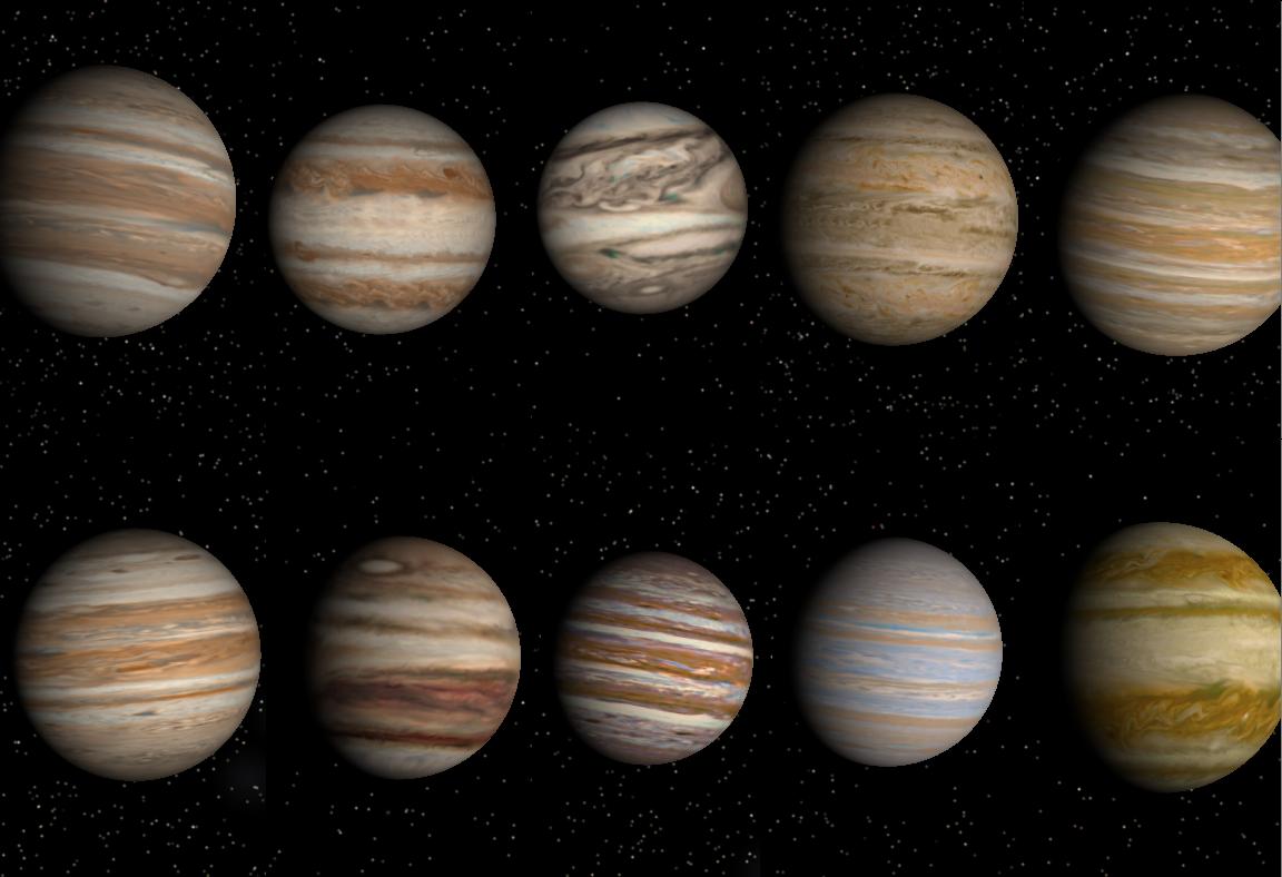
I worked on the planet with the various yellows, burnt sienna and burnt umber, and titanium white. To get a more natural, irregular looking striation, I tried the fan, but as usual didn’t like how it gets clumpy when wet; the grainer brush is better...but the effect still looked messy and not dimensional. So I did more striping/layering with a round brush and the edge of a flat brush, and some glazes of yellow, orange, and red transparent iron oxides. These wonderful earth tones are similar in color to ochres and siennas, but completely transparent, imparting a warm glow.
Instead of painting fine stripes on the planet, which might look too distinct, I thought of scratching into the semi-wet paint to reveal layers; I tried the end of a brush handle, but it was too blunt... so I stuck the end of a cheap brush in the electric pencil sharpener! That worked well, though I then realized a manicure stick or skewer would do the same! I continued layering, glazing, scraping, and blending, feeling like I’d lost my mind, but it was starting to look closer. It was interesting to create an effect of density and complexity that is not regular or patterned; it needed the layering to be effective. Looking at my reference pics again, I saw that I needed more separate bands of striation, less of an all-over pattern. Also, the overall effect was now more orange than yellow; this was supposed to be a yellow gas giant. Still, I was starting to think it could work.

(Note that at this point I didn't worry about yellows overlapping onto the mountains; it would be easy to cover that up when I finished the planet and moved to the mountains. Trying to stop the stripes exactly at that edge would have looked more artificial.)
The hilarious part: after all this agonizing over the background clouds, it occurred to me that the title lettering will likely cover much of that area!! Argh. Maybe they can run it along the left side.
Meanwhile, T. had emailed that he'd like to see my progress in two days. For the sake of my own pride, I'd better have something presentable by then...
I first set out to tackle the clouds. Phthalo + titanium white + a tidge of payne’s grey, then to make it more neutral I used a tiny bit of my newly acquired cad orange. I worked several shades of this, but it seemed clunky/murky. Clouds are so much easier to paint in watercolor, where washes blend spontaneously and layer transparently, and you can soften edges with a wet brush. So how to do it in acrylics, on this less absorbent surface? I have yet to answer that.
Then something interesting happened. It occurred to me to try a dry fan brush for blending. In the immortal words of UO prof Ron Graff: “This is a blending brush. It is not for painting ‘happy little trees'!" The idea is to stroke the dry fan over two adjacent shades of applied paint, moving it back and forth to create a smooth blend. Well, that worked a little, but the fan just wasn’t stiff enough to move much paint around... I still don’t have much luck with fans, especially nylon ones. So I cast about for something stiffer... pulled out this total piece of crap brush I have no idea why I even own, some closeout with a kiddy handle and very short, fairly stiff nylon bristles, and started rubbing the paint transitions with it... it’s perfect! It moves the paint around, smoothes out the joins, and creates interesting cloud-like textures. At last I see a use for stiffer bristles... to create a softer effect! Painting is funny that way.
I felt the whole effect lacked contrast, so I mixed a dark phthalo + payne’s + touch of cad orange. Then I regretted that as being too stark... but when I made some transitional tones, another interesting thing started to happen: forms shading to very dark edge, then white beyond it: hello Georgia O’keeffe! Probably too stylized an effect for this project, but something to file away for another time.
As often happens to me with painting, I started out feeling uncertain, had a peak of something exciting and unexpected happening, then flattened back to feeling frustrated/ discouraged by the end of the session: a sine curve of satisfaction. The clouds still seemed like an unfocused mess to me. Part of the problem is there was no particular lighting logic in where the darks and lights are, and I couldn't figure out what it should be. Obviously the clouds close to the planet should be bright, but what about the storm system closer to the viewer?
I continued to layer white over most of the snow lines, blurring the line between sky and horizon. I did several thin glazes of ultramarine + Open (slow-drying) gel over the blue sky, to make it less bright blue. (With each layer, I wiped off the blue in the ring area, to make that easier to paint white when I get to it.) I really regret painting the initial cerulean layer so unevenly; those strokes were proving hard to cover up. How to paint luminous daytime skies remains a mystery to me. No wonder Maxfield Parrish guarded his method so zealously!
I worked a little more on the yellow figure. Adding cad yellow deep to my palette gave him more solidity.
I worked on the planet with the various yellows, burnt sienna and burnt umber, and titanium white. To get a more natural, irregular looking striation, I tried the fan, but as usual didn’t like how it gets clumpy when wet; the grainer brush is better...but the effect still looked messy and not dimensional. So I did more striping/layering with a round brush and the edge of a flat brush, and some glazes of yellow, orange, and red transparent iron oxides. These wonderful earth tones are similar in color to ochres and siennas, but completely transparent, imparting a warm glow.
Instead of painting fine stripes on the planet, which might look too distinct, I thought of scratching into the semi-wet paint to reveal layers; I tried the end of a brush handle, but it was too blunt... so I stuck the end of a cheap brush in the electric pencil sharpener! That worked well, though I then realized a manicure stick or skewer would do the same! I continued layering, glazing, scraping, and blending, feeling like I’d lost my mind, but it was starting to look closer. It was interesting to create an effect of density and complexity that is not regular or patterned; it needed the layering to be effective. Looking at my reference pics again, I saw that I needed more separate bands of striation, less of an all-over pattern. Also, the overall effect was now more orange than yellow; this was supposed to be a yellow gas giant. Still, I was starting to think it could work.
(Note that at this point I didn't worry about yellows overlapping onto the mountains; it would be easy to cover that up when I finished the planet and moved to the mountains. Trying to stop the stripes exactly at that edge would have looked more artificial.)
The hilarious part: after all this agonizing over the background clouds, it occurred to me that the title lettering will likely cover much of that area!! Argh. Maybe they can run it along the left side.
Meanwhile, T. had emailed that he'd like to see my progress in two days. For the sake of my own pride, I'd better have something presentable by then...